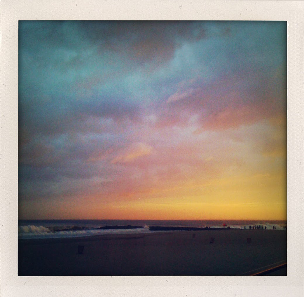
Hurricane Earl. Favorite spot ("the box") and sunset fireworks. I think the bouy was showing 8-10ft. The sky just lit up suddenly, and kept changing, but always looked like a lost Cocteau Twins album cover.
Tuesday, September 14, 2010
I've been supplying surf art to a very eco friendly t-shirt company that is using a unique screen and dye process to create their shirts. Here's an image for one of the shirts. I found some really old press-type at the back of an art store and was thrilled to have a chance to really use it in combination with some hand lettering.I 'll be sure to post images of the final products when the samples come in.
It's always interesting, for a variety of reasons, to visit old ideas and try to stretch within them for a client. Here we revisit the idea for the Big Surf cover from '02 designed by David Carson. CD cover and interior spread.
I had a really busy summer but i wanted to take on this project to play with the image/type relationship and managed to do all the type and drawing on a plane, to and from, Arizona.
Friday, May 21, 2010
Today my interview on DesignIsMyThing, Facebook site, is posted (link Below). My interview is #100. The site is a Q&A for to various compelling designers and creative types. Cool site/good reads.
In the interview I talk a little about how all the work I do is derived from intuitive experiments in the sketchbooks and how the Micro/Macro stuff is rooted in basic Philosophy 101. This is the original image in my sketchbooks that started the whole thing and below is the Harvard Business Review piece I talk about in the interview.
I was auditing a Philosophy class for kicks years after my college graduation and the one day the professor was talking about "spheres of justice". I went home and just started working in the sketchbook and above is what came out. I title it The Primordial Sphere Of Justice in the aftermath, made a postcard of it sent it out and that particular direction for my work was born and continues to this day.
Here's the Harvard Business Review piece mentioned in the article. The author of the article was really struck with the image and wound up buying it and the spot illustration. I threw in the drop caps I did for the article because i'm a completist.
spot
drop caps
Tuesday, May 18, 2010
Anatomy Of An Editorial Assignment: These are some of the original sketches I submitted for an editorial assignment about how algorithms used for high speed trading are actually learning to become smarter, faster and even unethical and need to be policed somehow. The article really scarred the hell out of me but my instinct was to portray the mind that is now in the machine rather than spook the audience with a hellish portrayal. The comments from the art directer were that the sketches were too metaphysical, the piece was more about the sleuthing and that the 0's and 1's were good.
These are some of the revised sketches. Art director and editor loved 'em but there was an article about China a few pages deeper in the mag and asked if I can change the color scheme away from a China red and also change the large 0's and 1's to Stock Symbols.
Here's one of the the revised final sketch before final art with a different color scheme.
This is the final art I turned in except that I got an e-mail asking if I could delete the whiskers on the dragon because and editor thought they made it not look like a dragon so...
Here's the final art that was published. Very spooky that the week I was working on this piece the very subject of this article about algorithms going out of control in the markets actually caused a pretty intense event in the markets that made worldwide news. I had a friend who actually programmed some of these and when asked who he worked for he would joke, Skynet...
One of the things I do enjoy about editorial and the process of editorial is how plastic and malleable ideas and images are. I thought this was a good example of how a final piece of illustration goes through this process of manipulating form and idea to get to a specific communication through a dialogue with several individuals. This, in contrast to the "this first sketch is brilliant, we love it, go to finish" thing.
Thursday, May 13, 2010


I'm going to start adding random sketchbook pages to the blog. nothing as ambitious as a page a day sort of thing but i do have thousands of images that no one ever sees unless they request the books, stop by the studio or happen to catch a lecture of mine. I used to drop off the sketchbooks with my portfolio and folks really loved rummaging through them. This usually resulted in an image or two being sold directly out of the books but these days portfolio calls are so rare as the web basically functions as a portfolio. Once, Metallica requested my sketchbooks so i sent them off hoping they'd have some Yagermeister spilled on 'em...but they just broke lock on the carrying case and asked me to submit art for St. Anger (my solution was sooooo much cooler then what they went with. i'll post those images and that story some day as it's rather rock & roll story... ;). These are from a Molkskine travel sk-book.
Thursday, May 6, 2010
Wednesday, April 21, 2010

I'm really into these concentrated watercolor dyes for this series. Here's the palette explorations, process photos,and final piece before it's cut from the board and framed for the Affordable Art Fair show-NYC May 6-9.


System Song 2, 19"x25". The colors are much richer and vibrant in person. Check it at the show.
Tuesday, April 20, 2010

This is the palette used for the piece below which will be shown at the Affordable Art Fair in May. I show this to give some idea of the true colors of the piece as they never really translate and, i think it's cool. I'm thinking that there will be at least 10 pieces in this series.

SYSTEM SONG 1 detail

SYSTEM SONG 1 framed
Friday, January 29, 2010
Subscribe to:
Posts (Atom)