Tuesday, September 14, 2010

This summer Head Snowboards asked me to work on a series of snowboards for the general market and their pros. Here's the logo for the bottom of the boards originally designed by Sven Hoffmann. Sven asked me to interpret the logo in the micro/ macro approach. The only guideline was that the logo has to read on a photograph when the riders do big airs in the pipe...!!!Brilliant!!!
Below are the final board designs and an artists signature logo that will appear on each board. Also, Sven and Christian, from Head, made a trip to Brooklyn all the way from Hamburg Germany and Saltzburg Austria to see the final art/designs. Always so nice to have guests in the studio. Great visit.

Head Snowboards-Pro Riders Model. 
The challenge was to create a board that specifically addressed the interests of their top three riders in a loose narrative, graphic novel, approach. Since this board was to be produced as a special board for the riders, I thought that creating all the art by hand would give it a more cared for look. Below are some of the board details.

 
Here are a series of shots showing some of the elements of the Pro-Riders board taking shape in the studio. It was really fun to get back to some old school techniques (stretching watercolor paper, gouache, airbrushing, cutting frisket film ).
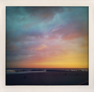
Hurricane Earl. Favorite spot ("the box") and sunset fireworks. I think the bouy was showing 8-10ft. The sky just lit up suddenly, and kept changing, but always looked like a lost Cocteau Twins album cover.
I've been supplying surf art to a very eco friendly t-shirt company that is using a unique screen and dye process to create their shirts. Here's an image for one of the shirts. I found some really old press-type at the back of an art store and was thrilled to have a chance to really use it in combination with some hand lettering.I 'll be sure to post images of the final products when the samples come in.
While vacationing in Montauk this summer I finally had a chance to visit Jackson Pollock and Lee Krasner's home and studio. Here are, the studio, the studio floor, their hi-fi, and a quote from Lee Krasner. My favorite Jackson Pollock quote read from the walls of his studio: "I deny the accident".
It's always interesting, for a variety of reasons, to visit old ideas and try to stretch within them for a client. Here we revisit the idea for the Big Surf cover from '02 designed by David Carson. CD cover and interior spread.

I had a really busy summer but i wanted to take on this project to play with the image/type relationship and managed to do all the type and drawing on a plane, to and from, Arizona.