Recently I traveled to PETERS GLAMALEREI STUDIOS in Paderborn Germany to oversee a public art project for the MTA subway station in Rockaway Beach, New York. Directly below is the original art I created that will be painted on glass blocks and installed in the spring of 2010. The following images show the initial fabrication process, some glass experiments I did while I was there and some inspiring images from the town of Paderborn.
Monday, December 14, 2009
One of the large studios at PETERS STUDIOS. The studio where I worked was up the stairs.
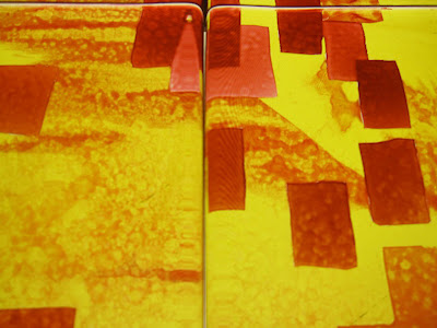
These are the initial test blocks I arrived to. I thought the technique and execution was fantastic but the only problem was that the colors needed to be more saturated and vibrant more like the way they appear on the computer screen rather than any printout. Since the community where the art is to be installed is a vibrant mix of cultures, each that have their own colorful associations, the colors needed to reflect these associations and vibrancy.
The new color tests based on our discussions before firing.
These are the new color test I woke to the next morning after our discussions about how color should function in the piece. Perfect...
The original art was created in the computer as a RGB file to take advantage of light so we referenced the actual computer file on screen to decide on final colors.
Blocks in the frame which represents the actual final space between the blocks after installation being masked for the next color application and firing. Notice the one to one final art printout underneath for reference.
The same blocks as above after firing. Gray 50% neutral rainy day in background.
Test for the color and frisket of the faces section based on a 600dpi and a 300dpi file. 600pdi, pictured on the right, was the clear standout. The overall spiral image of the heads was originally drawn in a small moleskine sketchbook and scanned for inclusion in the art.
Freshly fired blocks right out of the kiln. It takes several days to fire and cool this many blocks.
There was quite a bit of downtime in between discussions about the MTA project and test firings so they gave me a studio, access to all their materials and studio artisans for technical advice and guidance. The Image above and the next series of images are from experiments with the medium of glass I did during my stay at PETERS STUDIOS.
This series is an experiment with and image out of my sketchbooks where we decided to sandblast the type and add some airbrushed color after. This is the peeling of the frisket created from the scanned sketchbook page.
The piece post sandblasting/pre firing in the kiln. A pretty nice size...
The final piece
This was a failed experiment that never made it to the kiln for firing based on the same image from my sketchbook as above. The type was going to be fired as a black line but the black paint kept peeling up when we tried to remove the frisket. We determined that it would have been best to silkscreen the black line then fire it. Next time...
These images are these gates that were all around the base of the cathedral going into various alcoves. They were incredibly striking as the light from outside streaming in to the darkened cathedral really helped to contrast and create silhouette shapes that enhanced the illusion of perspective. Up close you could see that they were painted with great detail. They really illustrated the ideas they propose as an overall experience.
Subscribe to:
Posts (Atom)