Monday, May 20, 2013

MTA Public Art—Central Ave Station: Generation Dynamica


I'm thrilled to officially announce my receiving a second commissioned artwork from the MTA. It will be a permanent installation of public art for the Central Ave. Subway Station in Bushwick, Brooklyn on the M line. In total, there will be 20 (two sets of 10) panels that will feature the artwork cut out of 30 X 44.5"- 316 stainless steel panels. The panels will serve as windscreens for the elevated subway station.

This post will feature the images of the final art that will be laser cut out of the panels, some of the images from the original proposal and explanations of the process for the project and how it evolved.


Architectural renderings of the station and a comp of the final 2-panel option.


Final art for laser-cutting.


Photo sample of 316 Stainless Steel Panels (for color and tone).


Details


The initial proposal had panel sets of four (4) grouped together to be painted black and were much more kinetic and vibrating, in regard the visuals. At this point I understood that there wasn't much that couldn't be done in regard to the actual cutting of the panels so I was mostly concerned with getting my ideas and intent across to the selection committee. If the idea was chosen, then we can easily figure out the details regarding the execution.


The three images above are from— The original proposal I had submitted, all of the art for the 4-panel option, the art inset within the architectural drawings and a comp of the art (to a "relative scale") in a photo of the existing station. 

I had also included a 2-panel option in the initial proposal. I was really surprised that I preferred this option. It seemed to broaden the overall experience of the art when it was placed into the architectural drawings (images below).


In the end, the committee decided upon the 2-panel option with the feedback of —1. Figure out how to solve the problem of the smaller figures and art needing to connect somehow as the panels need to be a single piece of laser cut steel. 2. Tone down the vibrating aspect of the art, just a bit. 3. Perhaps the stainless steel natural finish would be a nice option for the art. All sounded good.


The final art—all together.

I have had such a strong connection to this area of NYC because from 1999 until 2007 I lived in, and ran, my art studio out of my apartment near the M line subway that runs down Myrtle Avenue. While living there I felt openly welcomed and, as much as possible, integrated into the community. I've experienced it as a community with a rich cultural past and heritage that broadened my own cultural experience. Strangely though, while I was living there I was reading Tropic of Capricorn by Henry Miller and in the book there is an entire passage that describes how Myrtle Avenue “...leads to America’s emptiness” and how nothing of value or substance has ever emerged from Myrtle Avenue. The passage goes on to describe an insufferable bleakness and sorrow about Myrtle Avenue that simply escalates with each paragraph. I remember laughing out loud and I was really astounded at how strange it was to  actually be living in the place that this bleak passage referenced and how this sentiment was entirely contrary to my own experience of living there. What I had witnessed, firsthand, on Myrtle Avenue was a vibrant, diverse, welcoming and thriving community of families and individuals who were actively engaged in their lives, finding joys and satisfactions throughout and expressing themselves and their interests to the fullest. 


Myrtle Ave Apt.—backyard.

While my wife was briefly living with me during the last few months before I moved away from Myrtle Ave, she was talking to someone at a party who was raised in the neighborhood and had found his way to a prominent position in the music industry and when she mentioned where she was living he paused and said “Now that’s a dynamic neighborhood...”. My thoughts exactly...


The piece is titled—Generation Dynamica

Thursday, April 11, 2013

The Agency Group Poster


Above is the on-press, first run, of The Agency Group's informational poster. The poster serves to announces the impressive list of talent they represent in a wide variety of music, creative fields and public speaking and was a giveaway at conventions, for employees and associates. I was approached by MALCONTENT   (Mark Kingsley) to create an image for the front of the poster. There were only two main parameters: 1. Black and white. 2. Has to say The Agency Group on it.

Mark is simply one of my favorite creatives as I worked for his agency Greenberg/Kingsley back in the 90's, right out of art-school, and it's there where I learned most of what I know about presenting a wide range of ideas to clients, how solutions evolve through this process and how a willingness to explore options and accidents may emerge into fully realized, thoughtful and unexpected results.

Initially I though a "Teenage Makeout Session" might be an interesting idea to explore since this was going to be mostly for in-house distribution and the client seemed open to something adventurous that had an impact. The trick was to figure out the line between "Disney" and Tawdry. In the end the idea evolved into a dance-club scene that, to my eye, reminds me of club flyers and posters I loved from the 80's.

Mark picked up the Op-Art patterns from the front for the back of the poster. It brings the whole thing together and makes it sing.

Below are details from the poster, a few of the initially rejected sketches, the approved sketch, proccess shots of refining the sketch and finalizing the art, final PDF images of the poster and video of the press run.


Friday, April 5, 2013

!What If? Corporate Art


Here's a start to finish look at a Corporate Art piece created for the fine folks at !What If?. The only direction I was given was to consider three prompts that reflected the company's core values and use them as a guide to create an original piece of art that would eventually travel to their international, internal, gallery locations.

Exploring the possibilities for the quote "The Opposite Of Love Is Not Hate, It's Indifference" was the most alluring of the prompts. I had wanted to get into the silkscreen lab for a long time with the intent of creating some really large silkscreens of images from my tiny sketchbooks and thought this would be a great opportunity for this approach. !What If? loved the idea and told me to run with it.

Above is the final silkscreen that was signed as 1/1. After framing, the dimensions are 40"x52".

Below are original tiny sketchbook pages, initial "sketches" (rejected), silkscreen lab shots and a quick shot of the final framed image.

Was a fantastic project to work and a former (very talented) student suggested they consider my work. Good to see former students out in good company, finding their way.


Friday, February 22, 2013

Head Snowboards 2013

Here's the final product shots for the 2013 Head snowboard series I worked on with the creative team of Sven Hoffmann @ Design Büro and Christian Wolf @ Head. The art direction was —"They need to tell a story" and was was given total freedom to generate art that was then remixed by the designers at Design Büro. Really thrilled with the result and the co-lab experience. Below are some more product shots and some process stuff. Get one while they are still around.Tis a sweet ride..http://www.ridehead.com/snowboard/products/boards/unisex/the-evil-kers-flocka/4938/?region=ww


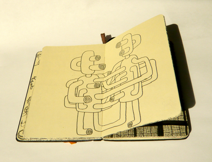
I was on the subway when I drew this in one of the my many little travel sketchbooks. It served as the original thoughts for the SheYeti & HeYeti boards.


Process for the He-Yeti art.


Original Tape Art, some Snowflake art on the wall and The Sun below (taken from a loose sketchbook exploration) that was later, heavily, remixed by the amazing crew at Design Büro. You can see the art from last year's He's Evli board hanging behind. Final result—She's Good, Flocka Board-http://www.ridehead.com/snowboard/products/boards/women/shes-good-flocka/4939/?region=ww


Pro Rider's Names Art for bottom of the boards.


Last year's She's Evil board I worked on along side this year's He's Evil Board. On a simply perfect day in Vermont this year. Love the ride on this thing. Go ride...