Friday, July 13, 2012

Monday, July 9, 2012

George Bates Studio—Rule #3: Make Waves.

Monday, May 14, 2012

SOUTH WALL - 36TH ST. ROCKAWAY, FINAL ART


The South Wall of the NYC MTA 36th Street Subway Station Art has been installed. Above is a shot of the final art as you enter the station from the turnstiles. The walls are about 35'x8'. My original invitation to submit proposals to the MTA Arts for Transit came about because the art director had seen images of my surf art on Club of the Waves. I've been surfing out at Rockaway beach since the early 90's and had always been impressed with the area for a such a diverse array of reasons.


The original art form my small sketchbook that served as the inspiration for the walls. I started this drawing while I was stuck on a subway car while everyone was waiting for it to get moving again.


 Right stairwell art.


Left stairwell art.


Thursday, March 29, 2012


Subway Art— South Wall Installation: In December of 2011 I was on site for the first phase-installation of the public art piece, I had originally created in 2009, for the NYC MTA -36th Street Subway Station, in Rockaway Beach. Above are some of the blocks that were created in Germany at GLASMALEREI PETERS  and then shipped to NYC after my visit to oversee the initial phase of the creation of the art. Below are shots from the installation.


The final block.


I love how the artisans at GLASMALEREI PETERS interpreted the original art and made the final piece so much better than I could have imagined, but overall, my favorite part of the piece is how the light streams through the piece and plays against the surfaces of the space, as the sun moves across the sky. It's an aspect that was so surprising and unexpected since I've never thought in terms of glass art before. The effect continually varies in intensity and tone throughout the day, creating these very fragile and beautiful illuminations of color throughout the space. Jörn Neumann, the Head of the Creative Department at PETERS told me— "If you create one painting in glass, you have actually created a many thousand paintings. What you see, is a different painting at every moment of the day because of how the movement of the sunlight and atmosphere affect and change the piece continually and throughout".


After the piece is cleaned and the side portions are installed and it's open to the public I'll post shots of the final South Wall section.
 

Friday, March 23, 2012


Here's a favorite recent job. It's for an article that explores Ponzi & Pyaramid schemes, how to identify them, their impact and the inherent failures of these ventures for STRATEGIC FINANCE  magazine. Title: Beware of False Profits—The Ponzi Scheme. I was struck by how the article explains that those who perpetrate these ventures are always extremely charismatic individuals. Below is the process.


A couple of the sketches initially presented. Of course, I love the skeleton but it's much too heavy for the publication.


The sketch is printed out and lightly, loosely, transferred to the scratch-board with homemade graphite paper, then inked with a sable brush.


Progress. The sketch is always close by and referred to from time to time.


With the micro/macro elements it's always a bit of back and forth between spontinaety and planning but ultimately thinking in terms of the space being very plastic.


A variety of tools are employed for the scratches. When finished, it's then scanned , contrast is adjusted, the areas for spot color are selected and adjusted then off to the  happy client.

Sunday, March 11, 2012


Here's my contribution for the  ADC YOUNG GUNS 10  commemorative poster & launch party on March 13th. The posters will be sold at the party for $25. Go get one!

 My work was featured in the YOUNG GUNS 2 show back in the '90s, sharing the spotlight with such young luminaries as Steve Savage and Tim Okamura. Good times, and great to see so many from that show continually creating outstanding work.

 The direction from ADC was to make some sort of X (for the 10th anniversary) over the YOUTH FADES type that was letter-pressed on the poster. I thought this would be a perfect opportunity for a Re-mix or Combines of my work and I could attempt my first Xerox Transfer.

 Below is the process for creating the Transfer image.

 
The poster as it arrived, with instructions.

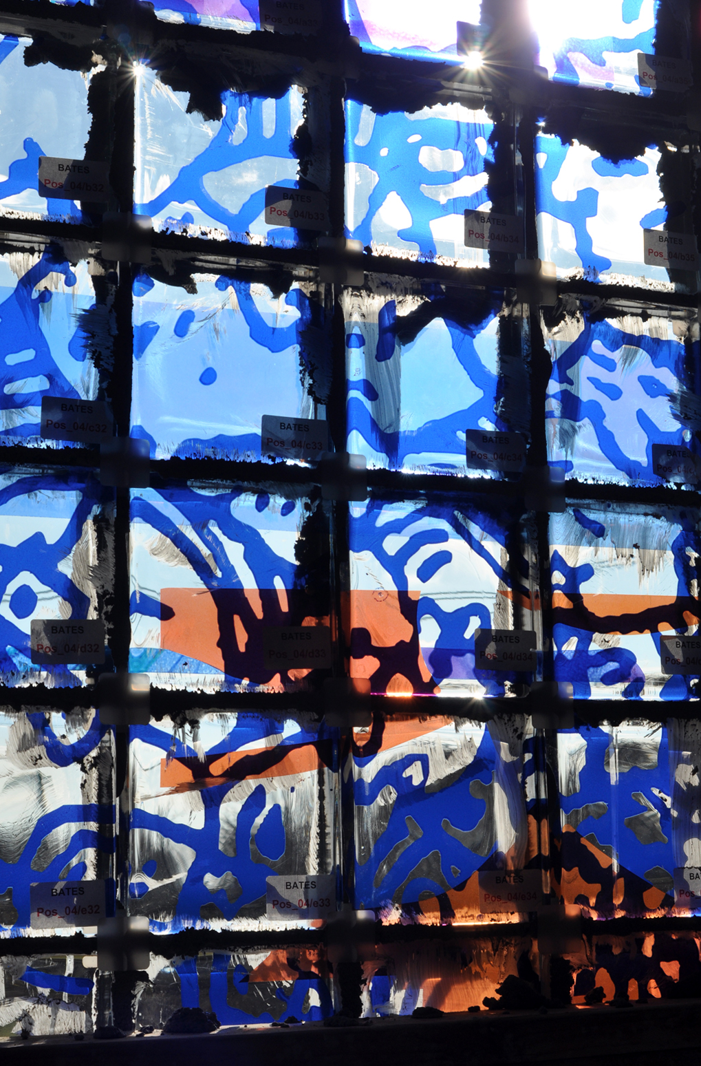
The Re-Mix in mid process.
 The original client work was from: Ebony, The Boston Globe, The N-Spired Story, The New York Times and The Washington Post

 The final image, proportional and registered to the poster art.

My favorite part is the consumer goods and bombs raining down on the adults who seem to have emerged from childhood, on the left part of the X, and how that editorial aspect serendipitously took shape out of playing with all the images.

 Next step: Get old school B&W copies of the image (in reverse), tape them together and register the image on the print and tape it down.

A friend recommended using Chartpak Blender Markers, instead of Acetone, to transfer the image. Simply, mark over the back of the copies.

Burnish.

Check to see if any areas need more attention and continue.
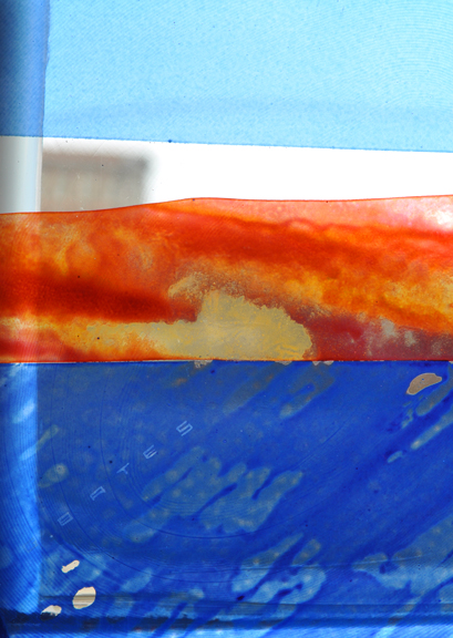
The Final reveal.

Final art detail.

Finished, signed, repackaged and ready for delivery to the party.